
The Three-Layer Architecture Behind Building Smartsheet Dashboards That Scale
- Bowen Liu
- Feb 17
- 5 min read

When Your Dashboard Outgrows Its Architecture
Most Smartsheet dashboards start the same way. Someone builds a few reports, points some chart widgets at them, and calls it done. It works until the workspace grows. Then the reports multiply, the widgets start breaking, and every small change turns into a maintenance project.
The issue isn't skill. It's architecture. There's a better way to structure your Smartsheet dashboards that makes them faster to build, easier to maintain, and reliable at scale. I call it the three-layer architecture.
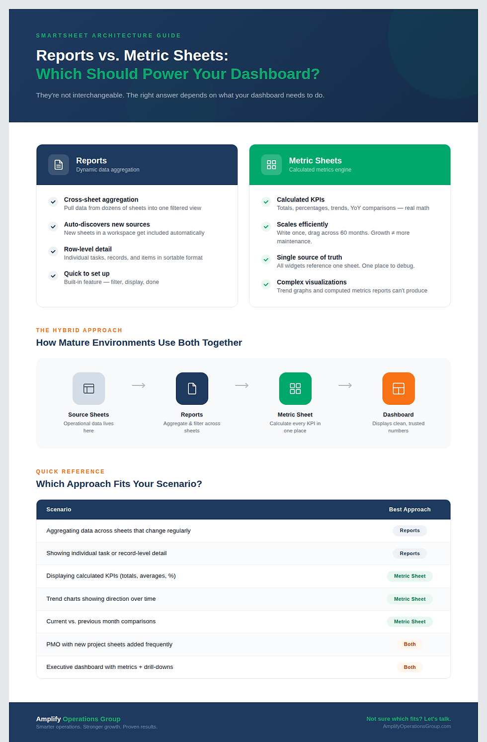
The One-to-Many Dependency Trap
The default approach in Smartsheet is to use reports as the data source for every chart and metric widget on your dashboard. Each widget gets its own report. Each report has its own filters.
This creates a one-to-many dependency problem. Your dashboard depends on dozens of individual reports, and each report is a potential point of failure. A renamed column, an empty filter result, or a restructured sheet breaks a widget. Multiply that across 15 or 20 widgets and you're spending more time maintaining the dashboard than using it.
There's a structural ceiling, too. Reports can aggregate and filter data, but they can't calculate new metrics. You can't build trend lines, cumulative totals, or year-over-year comparisons from a report. That limits what your dashboard can actually show.
How the Three Layers Work Together To Build Dashboards That Scale
The fix is separating your dashboard into three distinct layers, each with a clear job.

Layer 1: Source Sheet (The Foundation)
This is where your actual data lives. Task trackers, project logs, intake forms, financial records, operational data. Whatever your team is tracking day to day, this is it.
The source sheet's job is to be clean and consistent. Standardized column names. Controlled drop-down instead of free-text fields. Required fields where they matter. If the foundation is messy (inconsistent values, typos, missing data) everything built on top of it inherits those problems.
This layer is also where your data entry happens. Forms, automations, direct input from team members. The key principle: data gets entered once and stays consistent.
Layer 2: Metric Sheet (The Formula Engine)
This is the layer most people skip, and it's the one that changes everything.
A metric sheet is a dedicated Smartsheet that uses cross-sheet formulas to pull data from your source sheets, calculate every metric your dashboard needs, and organize it in a clean table format. Think of it as the brain sitting between your raw data and your dashboard.
The structure is straightforward. I set up columns for year, month, and month name, typically extending several years into the future. Then I write a formula that pulls the right data for a specific metric in a specific time period. Once that formula works for one cell, I drag it across the row and down the column. One formula, properly designed, can populate hundreds of cells in seconds.
This is where the real power lives. Because every metric is calculated in one place, you get complete control. Need a new KPI? Add a column. Need to change how something is calculated? Update one formula and every widget that references it updates automatically. Need data through 2030? Drag the formula down. Done.
The metric sheet also unlocks visualizations that are impossible with reports alone. Trend graphs that show direction over time. Cumulative charts that show growth. Month-over-month comparisons. These require calculated data points, and that's exactly what the metric sheet produces.
Layer 3: Dashboard (The Visualization Layer)
With the metric sheet in place, the dashboard becomes the simplest layer to build. It's not doing any calculations. It's not depending on fragile report connections. It's just displaying clean, pre-computed numbers from the metric sheet.
Every chart widget points at the metric sheet. Every metric widget pulls from the metric sheet. The dashboard is a window into data that's already been processed and validated.
This makes dashboard assembly fast. Once your metric sheet is built, you can have a polished, fully functional dashboard in an hour or two. And because every widget draws from the same reliable source, you don't get the blank-widget problem that plagues report-based dashboards.
Why the Benefits Compound Over Time
The benefits compound over time. In the first week, you notice that building new dashboard sections is faster. Within a month, you realize maintenance has dropped to almost nothing. After a quarter, leadership is requesting new views and you're adding them in hours instead of days.
Implementation speed increases because the drag-and-drop scaling of formulas eliminates repetitive setup. Instead of creating 15 reports for 15 metrics, you write one formula and replicate it.
Reliability improves because you've eliminated the one-to-many report dependency. If the metric sheet formula returns the right number, the widget will display the right number. There's no intermediate layer where things can silently break.
Scalability becomes a non-issue. New departments, new years, new metrics are all additions to the metric sheet. The dashboard structure stays the same. Your workspace grows without your maintenance burden growing with it.
Try It With One Dashboard Section
You don't need to rebuild your entire environment to adopt this architecture. Start with one dashboard section that's currently powered by reports.
Create a new sheet (your metric sheet). Set up your time columns: year, month, month name. Write a cross-sheet formula that pulls one metric from your source data for one time period. Verify it returns the correct number. Then drag it to fill the rest of the time periods.
Point your dashboard widget at the metric sheet instead of the report. Compare the results. Once you see the difference in reliability and speed, you'll want to migrate the rest.
Frequently Asked Questions
Do I still need reports if I use a metric sheet?
Yes, in specific cases. If your data lives across multiple sheets and new sheets are being added regularly (like a PMO where new project sheets get created) reports are still the best tool for that dynamic aggregation. The metric sheet handles everything else: calculated metrics, trends, comparisons, and any visualization that needs pre-computed values.
How many metric sheets do I need?
Start with one per dashboard. As your environment grows, you might separate metric sheets by function: one for financial metrics, one for operational metrics, one for project health. The key is keeping each metric sheet focused so it stays manageable and performs well.
Will a metric sheet slow down my workspace?
A well-designed metric sheet runs efficiently. The risk comes from overloading a single sheet with too many complex cross-sheet formulas. If you're hitting performance limits (flickering widgets, slow load times) split your metrics across multiple sheets. I've pushed metric sheets to their practical limits in large environments, and the solution is always to distribute the load rather than abandon the architecture.
Want a Smartsheet dashboard that actually scales? If you're tired of maintaining a stack of reports every time someone asks for a new metric, the three-layer architecture can change that.


Comments