
Why Your Smartsheet Dashboard Keeps Breaking (And How to Fix It)
- Bowen Liu
- Feb 17
- 5 min read

The Monday Morning Dashboard Meltdown
You open your Smartsheet dashboard on a Monday morning and the first thing you see is a blank widget where your KPIs used to be. The chart that tracked project health last week? Gone. The numbers leadership relies on for their status meeting? Showing errors or just... nothing.
If this sounds familiar, you're not alone. It's one of the most common problems I see across implementations, and it almost always comes from the same root cause: the way most people build their Smartsheet dashboards is fundamentally fragile.
Why Report-Based Dashboards Are Fundamentally Fragile
Most Smartsheet dashboards are built using reports to feed charts and widgets. On the surface, this makes sense. Reports pull data from your sheets, and widgets display it. Simple.
But here's what happens as your workspace grows: every chart on your dashboard is powered by a separate report. Each report has its own filters, its own criteria, its own connection to the underlying data. And when any one of those connections breaks (a filter returns no results, someone renames a column, a sheet gets restructured) your widget goes blank.
The problem compounds fast. You don't just have one fragile connection. You have dozens.
Three Problems That Show Up in Every Report-Based Dashboard
After working across dozens of implementations, I've found that report-based dashboard designs create three predictable problems. They show up in almost every environment that's been running for more than a few months.
1. Implementation Takes Too Long
From the end user's perspective, the dashboard looks simple. A few charts, some metrics, maybe a status summary. So they're wondering: why is this taking so long to build?
Behind the scenes, the architect is doing an enormous amount of manual setup. Every metric needs its own report. Every report needs configured filters. Every chart widget needs to be pointed at the right report with the right settings. Even when the dashboard looks clean, the plumbing behind it is manual and repetitive.
Small changes become disproportionately expensive. Want to add a new department to the view? That might mean creating new reports, adjusting filters across multiple existing ones, and validating that everything still displays correctly. A simple request turns into hours of work.
2. Widgets Break Too Easily
This is the one that erodes trust fastest. A report returns no data for a given filter (maybe it's a new month with no entries yet, or a status value got changed) and suddenly the chart widget shows a blank space or an error.
From the end user's perspective, the dashboard looks broken. They stop trusting it. And once trust is gone, they go back to asking for manual status updates in Teams or email, which defeats the entire purpose.
From the architect's perspective, debugging is painful. A blank widget could mean the report filter is wrong, the source data changed, a column was renamed, or the widget configuration drifted. There's no single place to check. You're hunting across multiple reports trying to find what broke.
3. It Doesn't Scale
This is where it really falls apart for growing organizations. Someone in leadership asks: can we add the new region? Can we include next year's data? Can we track a new metric?
Every one of those requests means more reports, more filter configurations, more widgets, more maintenance. The dashboard that took weeks to build now takes weeks to modify. And the end users start to notice. They stop requesting improvements because they know every request takes forever.
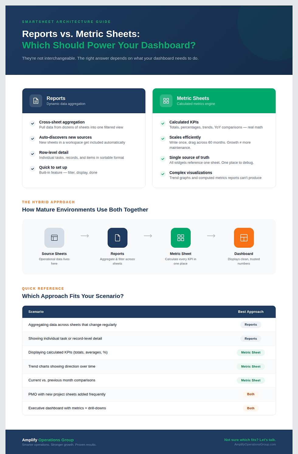
The Three-Layer Architecture That Eliminates These Problems

The solution isn't more reports. It's a fundamentally different approach to how data flows from your sheets to your dashboard.
I use a three-layer architecture that eliminates most of these problems:
Layer 1: Source Sheet (The Foundation).
This is where your actual data lives. Tasks, logs, trackers, intake forms, project records. This is your source of truth and it stays clean.
Layer 2: Metric Sheet (The Formula Engine).
This is a dedicated sheet that does all the calculations. It uses cross-sheet formulas to pull data from your source sheets, processes it, and organizes every metric your dashboard needs. One sheet. All your formulas. All your calculations.
Layer 3: Dashboard (The Visualization Layer).
The dashboard displays clean, pre-calculated numbers from the metric sheet. It's not doing any heavy lifting. It's just showing what the metric sheet already computed.
The difference is structural. Instead of each widget depending on its own report with its own filters, every widget pulls from the same reliable metric sheet. If the formula works in the metric sheet, it works on the dashboard. Period.
With this setup, implementation gets dramatically faster. You write a formula once in the metric sheet, and you can drag it across columns and down rows to scale it instantly. I've built metric sheets that generate every monthly metric through 2030 with a single drag-and-drop operation.
Maintenance becomes trivial. Need to update a calculation? Change it in one place (the metric sheet) and every dashboard widget that references it updates automatically. No hunting through dozens of reports.
And scaling? That's where the metric sheet really shines. Want to add a new department, a new year, a new KPI? Add it to the metric sheet. The dashboard picks it up automatically. Your workspace grows without breaking.
You also unlock visualizations that reports simply cannot provide. Trend graphs. Cumulative charts. Year-over-year comparisons. These require calculated data points that reports don't produce, but a metric sheet handles effortlessly.
Start With One Section
If your dashboard is currently running on a stack of reports, you don't need to rebuild everything overnight. Start with one section.
Pick an area of your dashboard that displays metrics, maybe a set of KPIs or a chart that tracks monthly performance. Build a metric sheet for just that section. Set up your year and month columns, write a formula that pulls the right data from your source sheet, verify it works, and then drag it to fill the rest.
Once you see one section running on a metric sheet instead of reports, you'll understand why this approach changes everything. And you'll want to convert the rest.
Frequently Asked Questions
Why does my Smartsheet dashboard show blank widgets?
Blank widgets almost always mean the underlying report returned no data. This happens when report filters don't match any current records, for example, a new month with no entries yet, or a status value that changed. The fix is to move away from report-dependent widgets and use a metric sheet architecture where formulas always return a value, even if that value is zero.
Can I use both reports and metric sheets in the same dashboard?
Yes. Reports are still valuable when your data lives across multiple sheets and new sheets are constantly being added, like in a PMO solution where new project sheets get created regularly. Reports handle that dynamic aggregation well. The metric sheet works best for calculated metrics, trend data, and any visualization that needs pre-computed numbers. Most mature implementations use both.
How long does it take to build a metric sheet?
For a focused dashboard section, you can have a working metric sheet in a few hours. The initial formula design takes the most thought. But once your first formula works correctly, scaling it is fast: drag and drop across columns and rows. I've built metric sheets that cover five years of monthly data in a single session.
What's the biggest mistake people make with Smartsheet dashboards?
Jumping straight to the dashboard without building the metric layer first. Most people start with "what do I want it to look like?" when the real question is "where is the data coming from and how is it being calculated?" If you build the metric sheet first, the dashboard assembly becomes the easy part.
Ready to stop firefighting your dashboard? If your Smartsheet environment is running on a stack of reports and you're spending more time maintaining it than using it, it might be time for a different approach.


Comments