
Reports vs. Metric Sheets: Which Should Power Your Smartsheet Dashboard Design?
- Bowen Liu
- Feb 23
- 4 min read

The Most Common Smartsheet Dashboard Design Decision
This is one of the most common architecture decisions in Smartsheet: should your Smartsheet dashboard design pull data from reports or from a metric sheet? The answer isn’t one or the other. It depends on what your dashboard needs to do.
I’ve built dashboards that use both, and the decision comes down to understanding what each approach is good at and where it falls short.
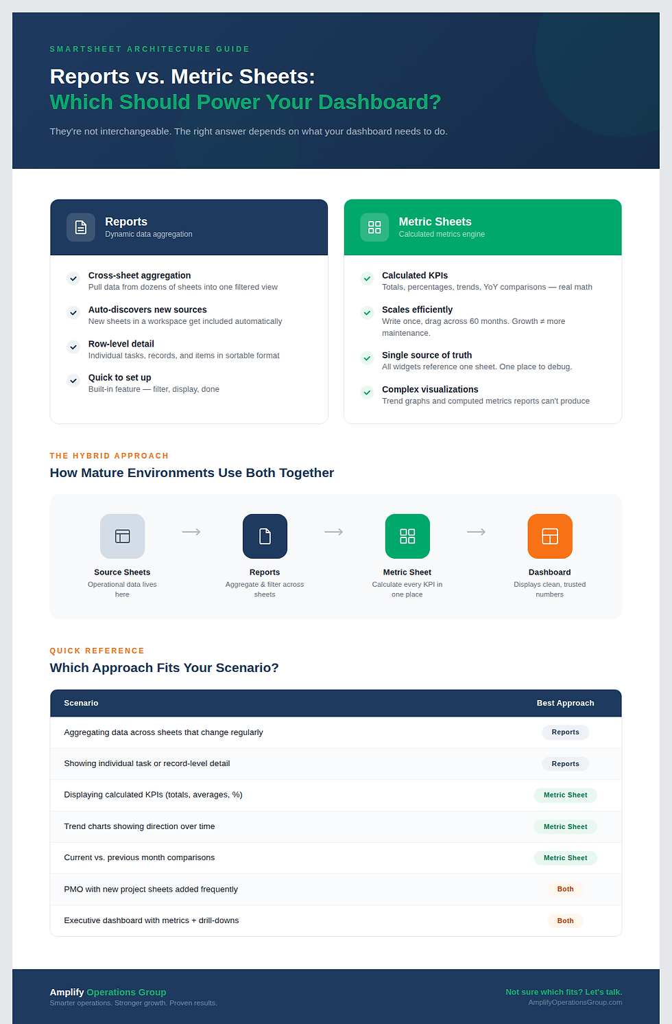
Why Reports Alone Stop Working at Scale
Most dashboards default to reports because that’s what Smartsheet makes easy out of the box. Reports pull data, widgets display it. But as the workspace grows, this approach creates two issues.
First, maintenance scales linearly. Every new metric means a new report with its own filters, configuration, and potential breakpoint. A dashboard with 15 metrics depends on 15 separate reports, and any one of them can silently fail.
Second, reports can’t be calculated. They filter and aggregate, but they can’t produce trend lines, cumulative totals, or year-over-year comparisons. If your dashboard needs computed metrics, reports alone can’t deliver them.
What Each Approach Does Well
Both reports and metric sheets have clear strengths. The key is knowing when each one is the right tool.
What Reports Do Well
Reports are Smartsheet’s built-in way to aggregate data across multiple sheets. If you have 30 project sheets and need to see all overdue tasks in one view, a report handles that cleanly. The data stays in the original sheets. The report just filters and displays it.
Reports excel at dynamic aggregation. When new sheets get added to your workspace (a new project, a new intake tracker, a new team), reports can automatically include them if they’re in the right folder or workspace. You don’t need to update anything. The report discovers new data sources on its own.
For PMO environments where new project sheets are created regularly, reports are essential. The report adapts to the changing workspace without manual reconfiguration.
Reports also work well for detailed operational views. When a user needs to see individual rows (specific tasks, specific records, specific items) reports present that raw data in a filtered, sortable format that makes sense for day-to-day work.
What Metric Sheets Do Well
A metric sheet is a dedicated Smartsheet that uses cross-sheet formulas to pull data from source sheets, calculate metrics, and organize them in a structured table. The dashboard then displays the metric sheet’s pre-computed values.
Metric sheets excel at calculated metrics. Monthly totals, cumulative sums, year-over-year comparisons, averages, percentages, trend data: anything that requires math beyond simple aggregation. The formula runs once, and the dashboard displays the result.
Metric sheets also scale efficiently. Write a formula for one month, drag it across 60 months. Add a new KPI by adding a column. The structure is inherently replicable, which means growing your dashboard doesn’t proportionally increase your maintenance burden.
And because every widget on the dashboard references the same metric sheet, you have one source to check when something looks off. No hunting across dozens of reports to find what broke.
The Hybrid Approach That Scales
Most mature Smartsheet environments use both. Reports handle the dynamic data aggregation, pulling records from across the workspace. The metric sheet takes the output of that aggregation and computes the metrics displayed by the dashboard.
In practice, this looks like: your source sheets hold the data. Reports roll up specific data sets when dynamic aggregation is needed. The metric sheet uses cross-sheet formulas to pull from both source sheets and reports, calculates every metric, and feeds the dashboard clean numbers.
The dashboard itself becomes a simple visualization layer. It’s not doing math. It's not dependent on fragile report-to-widget connections. It shows what the metric sheet has already computed and lets users click through to reports for the underlying details.
When to Use Each
Scenario | Best Approach |
Aggregating data across many sheets that change regularly | Reports |
Showing individual task or record-level detail | Reports |
Displaying calculated KPIs (totals, averages, percentages) | Metric Sheet |
Trend charts showing direction over time | Metric Sheet |
Cumulative or running total visualizations | Metric Sheet |
Current month vs. previous month comparisons | Metric Sheet |
A PMO with new project sheets created frequently | Reports for aggregation, Metric Sheet for KPIs |
Executive dashboard with high-level metrics and drill-downs | Metric Sheet for metrics, Reports for underlying detail |
Start With the Metrics That Break Most Often
If your current dashboard is entirely report-based and you’re experiencing blank widgets, slow maintenance, or limited visualizations, the metric sheet is the missing layer. You don’t need to remove your reports. You need to add the calculation engine between the dashboard and them.
Start with the metrics that break most often or the ones that leadership cares about most. Build those into a metric sheet. Point the dashboard widgets to the metric sheet rather than to the reports. Compare the results.
Frequently Asked Questions
Can a metric sheet pull data from a report?
Not directly through cross-sheet formulas. Cross-sheet references work with sheets, not reports. But you can structure your source sheets so the metric sheet pulls data directly from them, achieving the same result. In some cases, people use helper sheets that mirror report outputs to bridge this gap.
Which approach is faster to build?
Reports are faster for initial setup when you just need to filter and display existing data. Metric sheets take more upfront design time for the formula structure, but they scale much faster once the first formula is built. For a dashboard you’ll maintain for months or years, the metric sheet quickly pays back that initial investment.
How do I know if my dashboard needs a metric sheet?
If any widget on your dashboard shows a calculated value (a total, a percentage, a trend, a comparison), that calculation should live in a metric sheet. If your dashboard only shows filtered lists of records, reports alone might be sufficient. Most dashboards need both.
Not sure which approach fits your Smartsheet environment? Every implementation is different. The right architecture depends on your data structure, your team’s needs, and how you plan to scale.


Comments