
Why Your Smartsheet Dashboard Gets Ignored (And How to Fix It)
- Bowen Liu
- Feb 25
- 5 min read


Somewhere right now, there’s a Smartsheet dashboard that took you three hours to build. It has every metric your team needs. It pulls live data. It updates automatically. And nobody looks at it.
Between 60 and 80 percent of business dashboards go unused or underused. A Gartner survey found that 74 percent of executives don’t fully trust the dashboards they’re given. These aren’t numbers about bad software. These are numbers about bad design decisions.
I've built hundreds of Smartsheet dashboards. The dashboards that get ignored almost always fail for the same five reasons. Once you understand them, fixing yours takes less time than rebuilding from scratch.
The Mistake Almost Everyone Makes
The most common dashboard failure I see is building for "everyone."
You're trying to give leadership, project managers, and individual contributors one view that works for all of them. So you include every metric anyone could possibly want. You add charts to fill the space. You use color to make it look professional.
What you've actually built is a dashboard that satisfies nobody and tells no story.
A dashboard has one job: answer a specific question for a specific person. When you design for everyone, you're designing for no one. The stakeholder who opens it can't find their answer quickly, so they stop opening it.
The 5 Root Causes Behind Ignored Smartsheet Dashboards
1. Too many metrics
Every extra data point on a screen is a cognitive tax. Your viewer's brain has to decide whether each metric is important before it can move to the next one. Research from cognitive psychology calls this cognitive load, and there's a hard limit to how much a person can process before they disengage.
A dashboard that answers one question well beats a dashboard that answers twenty questions poorly. Start with the single most important decision your stakeholder makes each week. Build your dashboard to support that decision and nothing else.
2. No defined audience
Who is this dashboard for? Not "the team." Not "leadership." One specific person, making one specific decision, on a specific schedule. If you can't name them, your dashboard doesn't have a purpose yet.
3. The data isn't trusted
This one kills dashboards silently. If a metric widget shows a wrong number once, people stop believing all of them. A Precisely and LeBow College survey found that 67 percent of organizations don't completely trust the data driving their decisions.
The fix is architecture, not design. See how data trust issues destroy dashboards, and what to do before the first widget breaks.
4. Poor visual hierarchy
People scan before they read. Eye-tracking research confirms that viewers spend the first few seconds looking for context before they focus on any specific number. If your most important metric isn't near the top left of your dashboard, you're fighting human instinct.
Put your key decisions at the top. Put supporting context below them. Put detailed data at the bottom. This inverted pyramid structure maps to how people actually process information.
5. Color used decoratively instead of intentionally
Color has one job in a dashboard: direct attention. When every element is a different color, nothing stands out. When green means "good" on one widget and is purely aesthetic on another, your viewer has to consciously interpret every piece of data instead of letting it land.
Decorative color creates noise. Intentional color creates clarity. See the specific color rules I use on every Smartsheet dashboard.
What "Less Is More" Actually Means
Cognitive scientists distinguish between intrinsic complexity, which is the complexity of the information itself, and extraneous complexity, which is the complexity you've added through design choices.
You can't change intrinsic complexity. But you can eliminate extraneous complexity. Every redundant label, every decorative chart border, every color used for aesthetics instead of meaning, these are extraneous. They burn cognitive budget without delivering insight.
The dashboards my clients actually open every day have fewer widgets than the dashboards they don't open. Not because we hid information. Because we put it in the right place with the right architecture underneath.
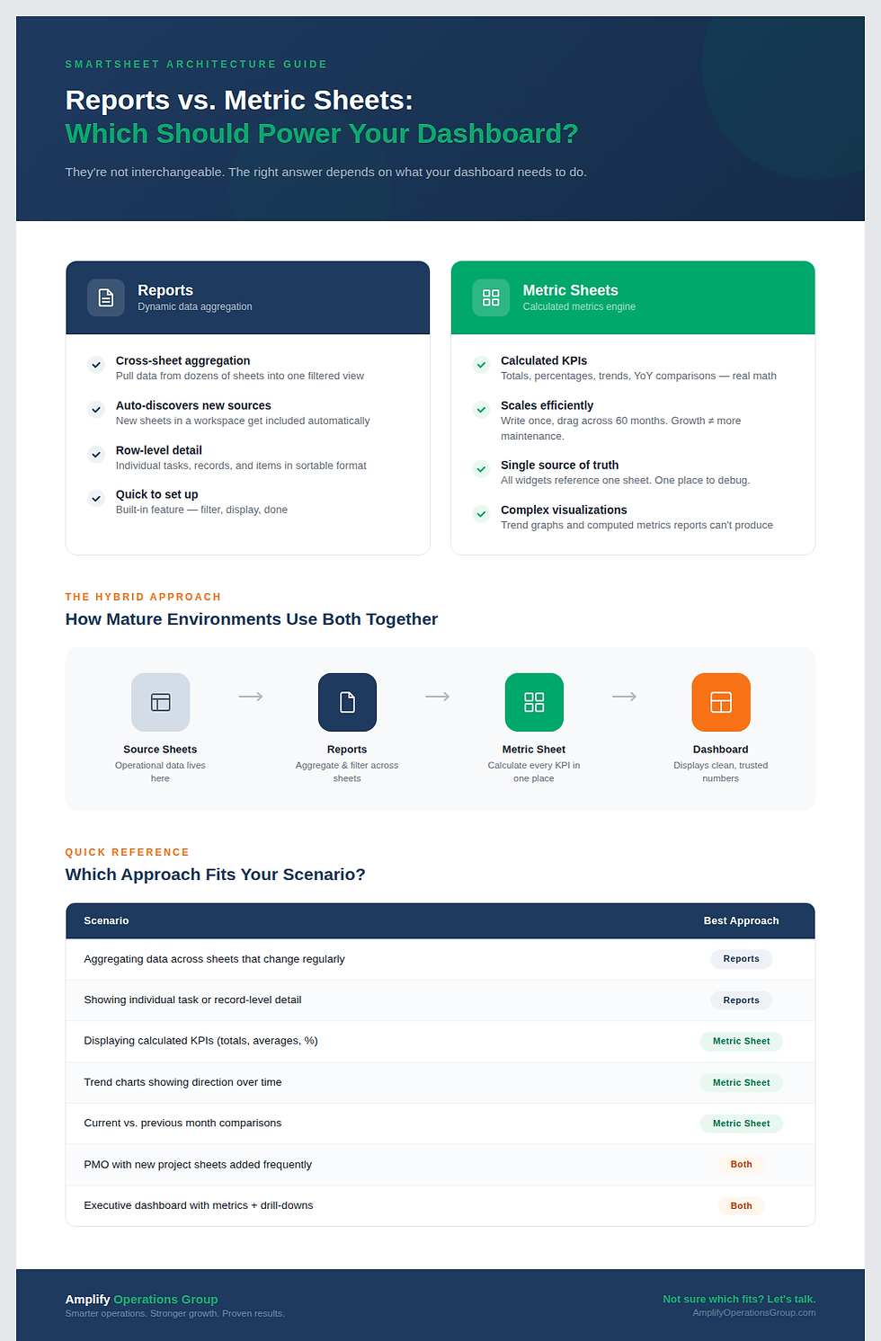
That architecture starts before the dashboard. It starts in your metric sheets. If you haven't set up a proper three-layer Smartsheet architecture yet, start here.
Before You Build: Four Questions
Before you open Smartsheet, answer these four questions:
• Who is the primary user of this dashboard?
• What is the one question they need answered every time they open it?
• What is the one action that answer should drive?
• What data does that answer require, and nothing more?
If you can answer all four in one sentence each, you're ready to build. If you can't, you're not designing a dashboard yet. You're arranging metrics.
The dashboards I've built that get used every single day share three things: one audience, one purpose, and intentional restraint at every level of the design.
If Your Dashboard Is Already Live
Abandoned dashboards don't announce themselves. There are specific patterns in how people interact, or stop interacting, that signal the problem before anyone tells you directly.
The Complete Framework
Everything above is the foundation. The complete framework for building Smartsheet dashboards that get used, including architecture decisions, widget selection, color system, and the specific mistakes to avoid at each step, is in the guide below.
Frequently Asked Questions
Why do most Smartsheet dashboards fail?
Most Smartsheet dashboards fail because they're built for too broad an audience with too many metrics. When a dashboard tries to answer every question, it effectively answers none. The result is a screen people stop opening because finding their specific answer takes more effort than asking someone directly.
What are Smartsheet dashboard best practices?
The core Smartsheet dashboard best practices are: define one primary user and one question before building, use a three-layer architecture (source sheets, metric sheets, dashboard), place your most critical metrics at the top using an inverted pyramid layout, use color only to direct attention rather than for decoration, and audit the dashboard 30 days after launch to confirm it's actually being used.
How many metrics should be on a Smartsheet dashboard?
There's no universal number, but every additional metric adds cognitive load and reduces the chance your primary metric gets noticed. Most effective dashboards have 3 to 6 key metric widgets plus supporting charts or a report. If you can't justify why a metric is there, it probably shouldn't be.
Why don't executives trust dashboards?
Gartner research found that 74 percent of executives don't fully trust the dashboards they're given. The primary driver is data quality concerns. If a metric has ever been visibly wrong, trust in the entire dashboard erodes and recovery takes months. The fix requires proper data architecture, not design changes.
What is the difference between a good and bad Smartsheet dashboard?
A good Smartsheet dashboard answers one question clearly for one defined audience. A bad dashboard tries to show everything to everyone. The visible difference is usually clutter: too many widgets, too many colors, no clear visual hierarchy. The invisible difference is usually in the architecture: bad dashboards pull data directly from source sheets instead of routing it through a dedicated metric sheet layer first.


Comments